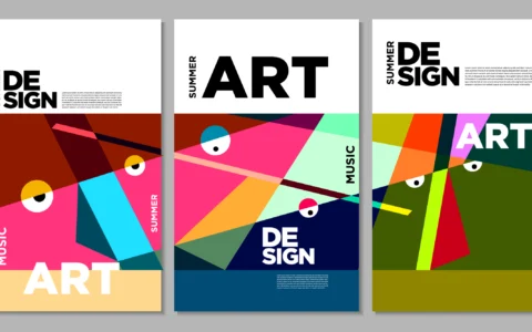
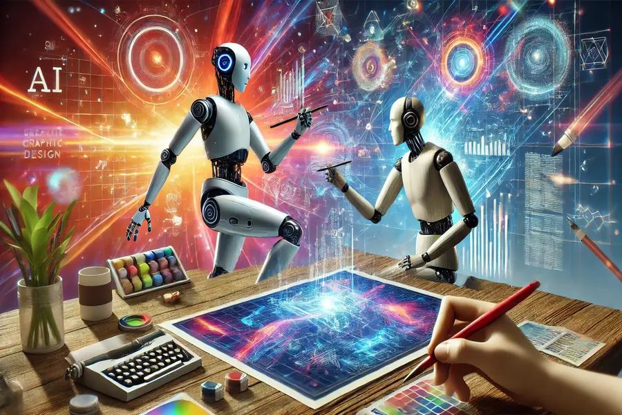
Anyone can type a single sentence into an AI generator and get a colorful picture back in seconds. But getting an image is not the same as creating a good graphic design.
Many AI-generated visuals end up looking messy, crowded, or instantly recognizable as “fake AI art.” Real graphic design requires balance, clear typography, brand consistency, and purpose.
If you use AI tools to design social media posts, flyers, web banners, or logos, here is what you need to do to make your graphics look clean, modern, and high quality.
1. Master the Basics of Visual Hierarchy
AI tools do not inherently understand what message your viewer needs to see first. That is your job.
Visual hierarchy means arranging elements so the human eye naturally follows a clear order:
- The Primary Focus: The main headline or focal image should always be the biggest element on the screen.
- The Secondary Detail: Subtitles, key details, or secondary visuals should be smaller and less prominent.
- The Call to Action (CTA): Buttons or website links should stand out clearly using contrasting colors.
When you prompt AI or assemble your design, always ask yourself: What is the very first thing someone should look at?
2. Write Specific, Style-Focused Prompts
Vague prompts like “make a cool banner for a gym” produce generic, cluttered results. To get sleek, high-end visuals, you must guide the AI with clear design details.
Give the AI Context and Composition Rules
When prompting, include information about:
- Layout: “Centered composition with wide margins” or “Grid-based symmetrical layout.”
- Lighting & Style: “Soft studio lighting,” “flat vector illustration,” or “minimalist product photography.”
- Mood: “Professional, clean, futuristic,” or “warm, organic, earthy.”
Mention What to Avoid (Negative Prompts)
Tell the AI explicitly what not to include. Adding keywords like “no text, no clutter, no realistic shadows, no busy background” keeps the output clean so you can add your own clean elements later.
3. Follow the 80/20 Rule: Never Publish Raw AI Output
The biggest mistake AI graphic designers make is taking a raw AI-generated image and posting it immediately.
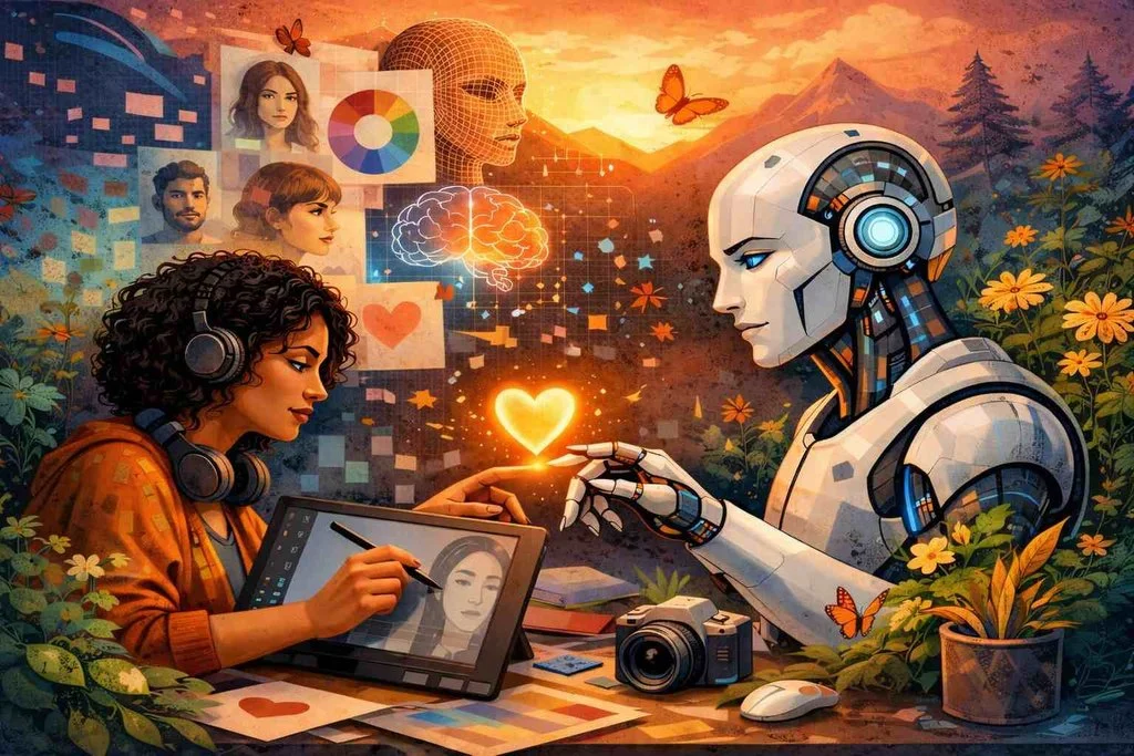
Think of AI as your assistant that handles 80% of the initial drafting. The remaining 20% requires human polish in tools like Canva, Photoshop, Illustrator, or Figma.
Always take your AI draft into a dedicated editor to:
- Crop and fix awkward compositions.
- Remove messy backgrounds or strange artifacts.
- Align shapes and text boxes to an exact grid.
- Upscale low-resolution outputs so they look crisp on high-definition screens
4. Fix Your Typography and Text Placement
Most image-generation AI models struggle with text. They often generate garbled letters, misspelled words, or awkward font combinations.
Unless you are using an AI design tool specifically built for vector text editing, it is almost always better to generate graphics without text and overlay the typography yourself in your editor.
Typography Rules for AI Designers:
- Limit Font Families: Never use more than two or three fonts in a single design. Use one bold header font paired with a clean, readable body font (like Sans-Serif).
- Give Letters Room to Breathe: Increase letter spacing (kerning) on uppercase subheadings to make them look sophisticated and modern.
- Maintain High Contrast: Never place dark text over a dark, busy AI background. Put text over clean white space, or place a semi-transparent dark box behind light text to keep it readable.
5. Embrace White Space
In graphic design, white space (or negative space) is the empty area around images, text, and graphics.
AI image generators love to fill every single pixel with detail, texture, and light flares. But crowded designs look cheap and overwhelming.
Good AI graphic designers actively create breathing room:
- Use prompts like “minimalist layout with plenty of empty background space.”
- Leave empty margins around edges so text isn’t pressed against the border.
- Remove unnecessary icons or extra background decorations that do not serve a purpose.
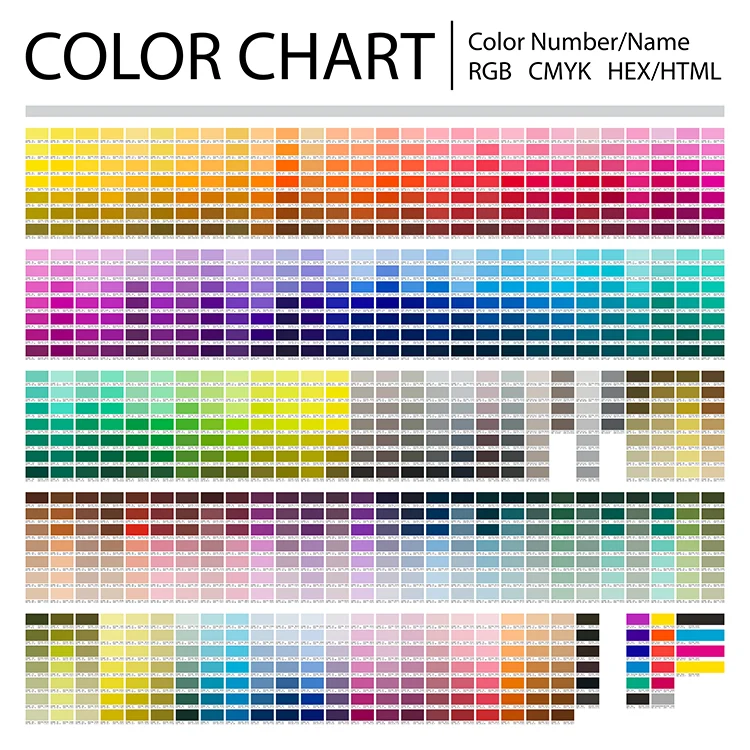
6. Stick to Strict Brand Color Palettes
A design that uses 15 different random colors will look chaotic. Professional designers control color intentionally.
- Pick 3 Main Colors: Choose one dominant background color, one secondary structural color, and one high-contrast accent color for buttons or highlights.
- Use Hex Codes: If your AI tool accepts brand color codes (like
#1E293B), feed them into your prompt or design settings. - Match the Mood: Use soft pastels for wellness and beauty brands, bold high-contrast colors for fitness and tech, or deep muted tones for finance and luxury goods.
Quick Checklist for Great AI Design
| Design Step | Traditional Bad Habit | Professional AI Approach |
| Prompting | Short, vague prompts (“cool tech logo”) | Detailed prompts specifying layout, mood, and style |
| Editing | Posting the exact image the AI outputs | Cleaning background artifacts and aligning in Figma or Photoshop |
| Typography | Letting AI draw messy text into the image | Adding clean, custom vector fonts on top of the image |
| Colors | Random rainbow palettes generated by AI | Restricting the design to a strict 3-color brand palette |
| Layout | Overcrowded images with no focal point | Ample white space with a clear visual hierarchy |
Final Thoughts: Taste Trumps Tools
AI gives you incredible speed and technical execution, but your human taste is what turns an output into art. The best AI graphic designers are not just good at writing prompts, they act as creative directors who curate, edit, and refine until the final piece looks seamless and intentional