
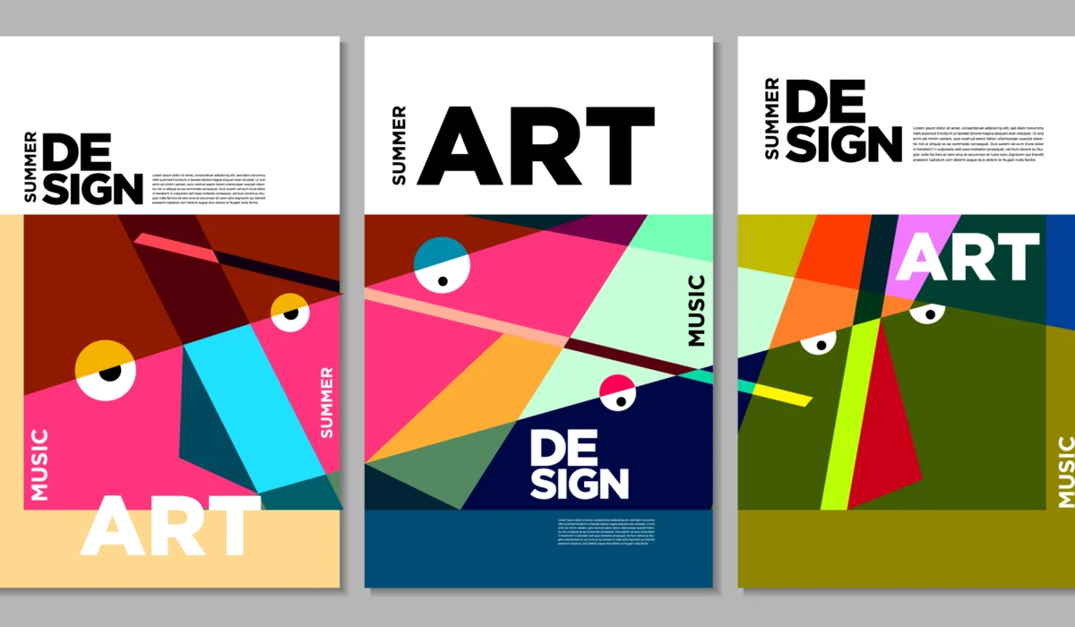
Have you ever looked at a flyer, website, or social media post that felt messy, but you couldn’t figure out why? Nine times out of ten, the problem is typography.
Typography is not just picking a pretty font—it is the art of arranging text so that it is readable, organized, and visually attractive. In fact, text makes up more than 70% of most digital graphic designs.
When you get your typography right, your designs immediately look more professional, high-end, and easy to read. Here is a practical, step-by-step guide on how to use typography correctly in your graphic design projects.
1. Create a Clear Visual Hierarchy
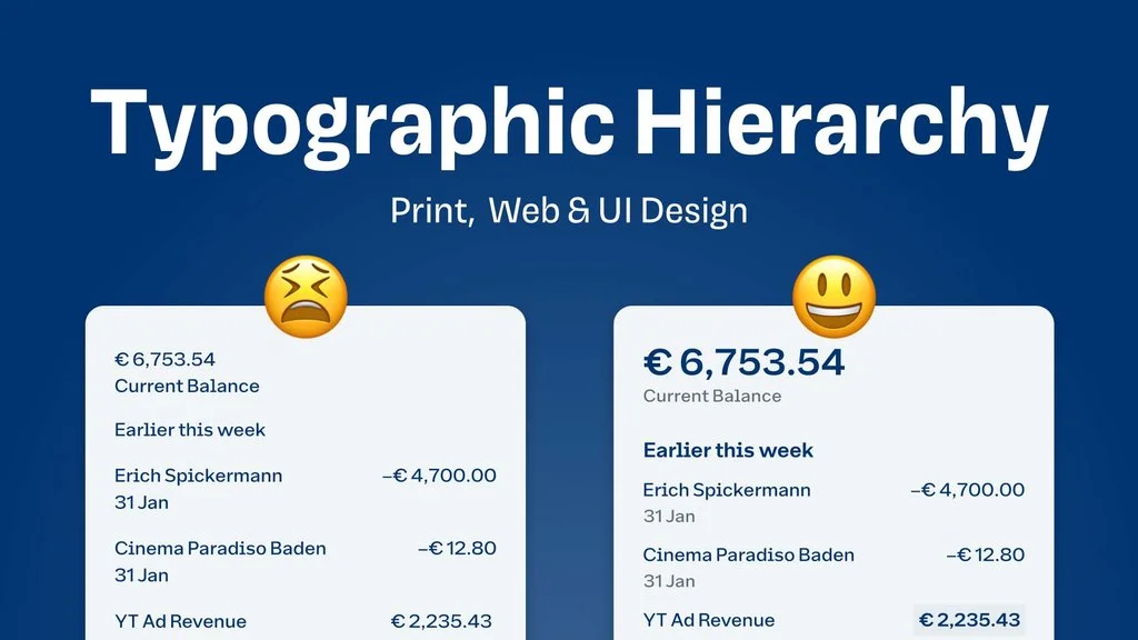
Visual hierarchy means guiding the reader’s eye so they know what to read first, second, and last. Without hierarchy, all text looks equally important, which confuses the viewer.
The Three-Level Text Structure
- Level 1 (Headlines): This is the most critical message (like your main title). It should be the largest, boldest text on the page.
- Level 2 (Subheadings): These break your design into smaller sections. They should be smaller than headlines, but distinctly larger than body copy.
- Level 3 (Body Text): This is the main information paragraph. It needs to be clean, simple, and comfortable to read.
Rule of Thumb: Make headline sizes at least 1.5 to 2 times larger than body text so the difference is instantly obvious.
2. Stick to the 2-Font Rule
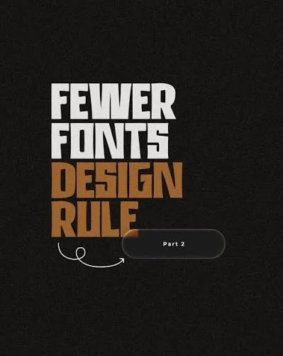
One of the biggest mistakes beginners make is using four or five different fonts in a single graphic. This creates visual noise and makes the design look amateurish.
How to Pair Fonts Successfully
- Limit yourself to 2 fonts: Use one distinct font for headlines and a simple, highly readable font for body text.
- Combine Serif and Sans-Serif: Pair a traditional Serif font (fonts with small feet, like Times New Roman or Playfair) with a modern Sans-Serif font (fonts without feet, like Helvetica or Inter) for instant contrast.
- Use Font Families: Instead of picking two completely different fonts, use one versatile font family (like Montserrat or Roboto) and switch between Bold, Medium, and Light weights.
3. Master the 3 Types of Spacing
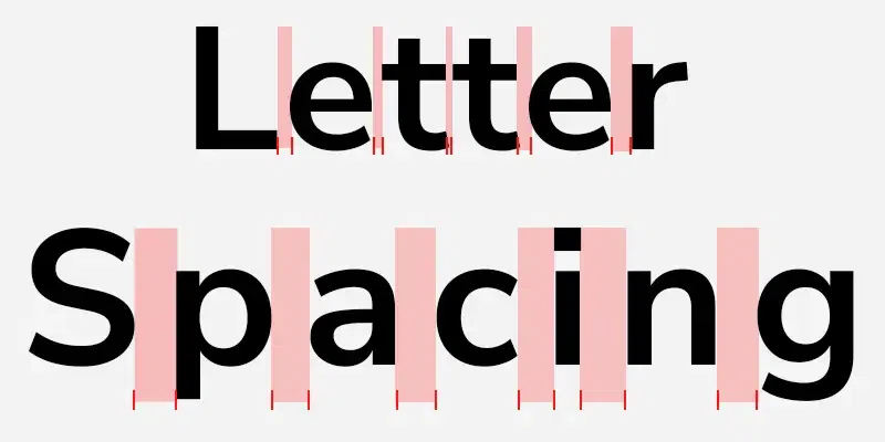
Spacing controls how “breathable” your design feels. If text is squeezed together, it becomes hard to read. If it is too far apart, it falls apart visually.
[ KERNING ]   ->  Space between two individual letters  (A v a)
[ TRACKING ]  ->  Overall space across a whole word     (W O R D)
[ LEADING ] -> Vertical space between line height (Line 1 Line 2)- Leading (Line Height): This is the vertical space between lines of text. For body paragraphs, set your line height to roughly 130% to 150% of your font size.
- Tracking (Letter Spacing): This is the overall space across a line of text. Increase tracking on ALL-CAPS headlines to make them look elegant, but keep body text tracking neutral.
- Kerning: This is the manual space between two specific letters. Adjust kerning when large headline letters look awkwardly far apart (like “W” and “A”).
4. Align Your Text for Natural Reading
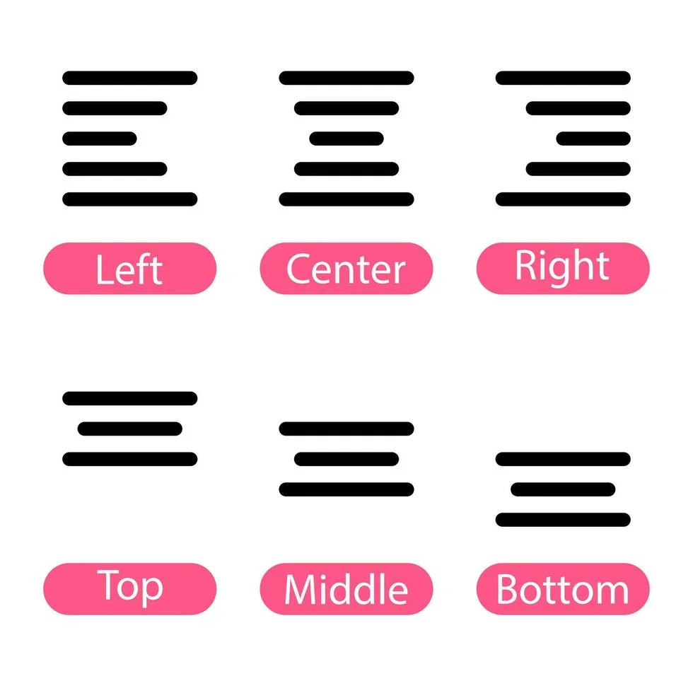
How you align your text heavily impacts how fast users can scan your design.
- Left-Aligned (Best Choice): In most languages, people read from left to right. Left-aligning body text creates a straight margin on the left, making paragraphs much easier to scan.
- Center-Aligned (Use Sparingly): Center alignment works great for headlines, invitations, or small 2-line blocks, but never use it for long paragraphs.
- Justified (Avoid in Digital Design): Justified text forces words to stretch across the page, creating ugly uneven gaps (called “rivers”) between words.
5. Keep Line Length Comfortable
If a line of text is too long, the reader’s eye gets tired moving back and forth across the screen. If it is too short, the reader’s eye has to jump down continuously.
- For desktop screens, aim for 50 to 70 characters per line.
- For mobile screens, aim for 30 to 40 characters per line.
Typography Cheat Sheet for Designers
| Typography Element | Recommended Best Practice | What to Avoid |
| Font Count | 1 to 2 typefaces per design | Mixing 4+ wild, unrelated fonts |
| Body Text Alignment | Left-aligned | Justified or center-aligned body blocks |
| Line Height (Leading) | 130% – 150% of font size | Tight lines touching each other |
| Headline Contrast | Bold, high-contrast, distinct weight | Headline looks the same size as body text |
| Color Contrast | Dark text on light background (or vice versa) | Low-contrast text (e.g., yellow text on white) |
4 Common Typography Mistakes to Fix Immediately
- Stretching Fonts Manually: Never pull the sides or top of a text box to make it wider or taller. This distorts letter proportions. Always change font size properly.
- Low Color Contrast: If gray text is placed on a slightly darker gray background, readers will struggle to view it. Always ensure strong contrast between text and background.
- Overusing All-Caps: Writing full paragraphs in uppercase lowers reading speed because all letters form uniform rectangular blocks. Save uppercase for short headers or buttons.
- Ignoring Widows and Orphans: A “widow” is a single word left alone at the bottom of a paragraph. Adjust line breaks or letter spacing slightly so single words never sit isolated.
Summary
Great typography isn’t about making text decorative it is about making message delivery effortless. By creating a strong visual hierarchy, keeping your font choices restrained, and leaving generous breathing room around your letters, your graphic designs will instantly look cleaner, more appealing, and completely professional.